
Hi, my name is Zoha Nadeer, and I'm a Digital Illustrator & Graphic Designer.
Get to know me

Background
Pakistani rising senior at Bucknell University currently pursuing a double major in Markets, Innovation & Design and Art & Design with an accidental minor in Religious Studies.
Passionate about creative projects, illustrations, and the power of visual storytelling, I am seeking opportunities to gain experience in advertising and creative direction.
My diverse academic background equips me with a unique blend of creativity, technical skills, and a keen eye for detail. Through my coursework and hands-on experiences, I have developed a strong foundation in organizational leadership, multicultural team management, social media marketing, and visual design.
I am proficient in Adobe Creative Suite, Sketchbook, Procreate, and Canva. I also do digital/film photography, printmaking, and 3D sculpture. My digital art and content portfolio is just a scroll away!


@sunburntbagels

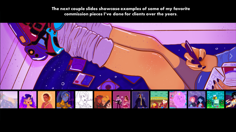
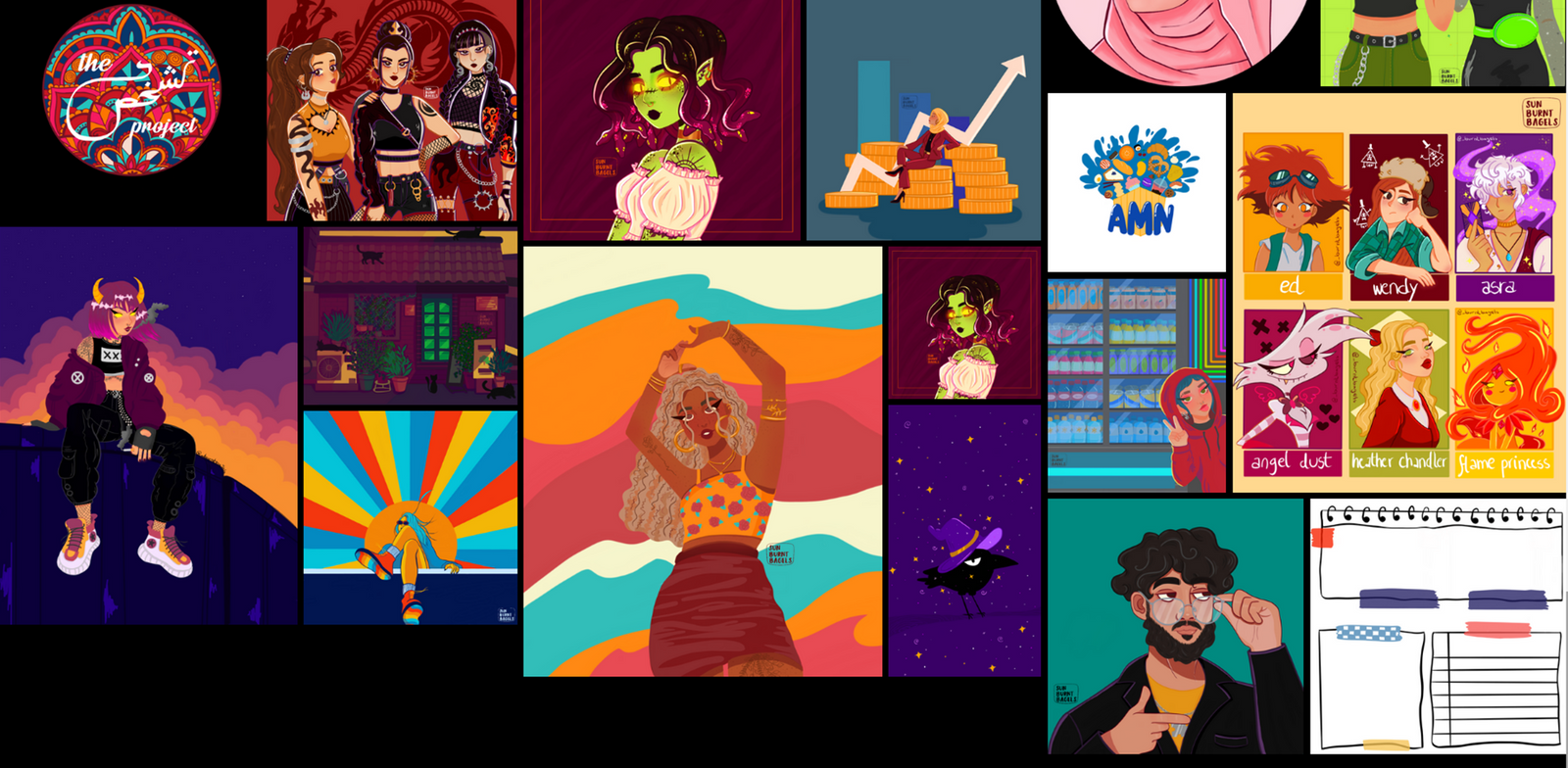
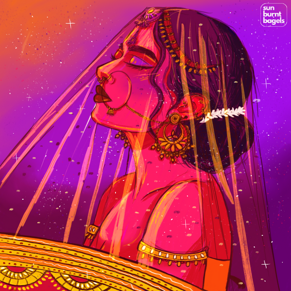
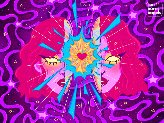
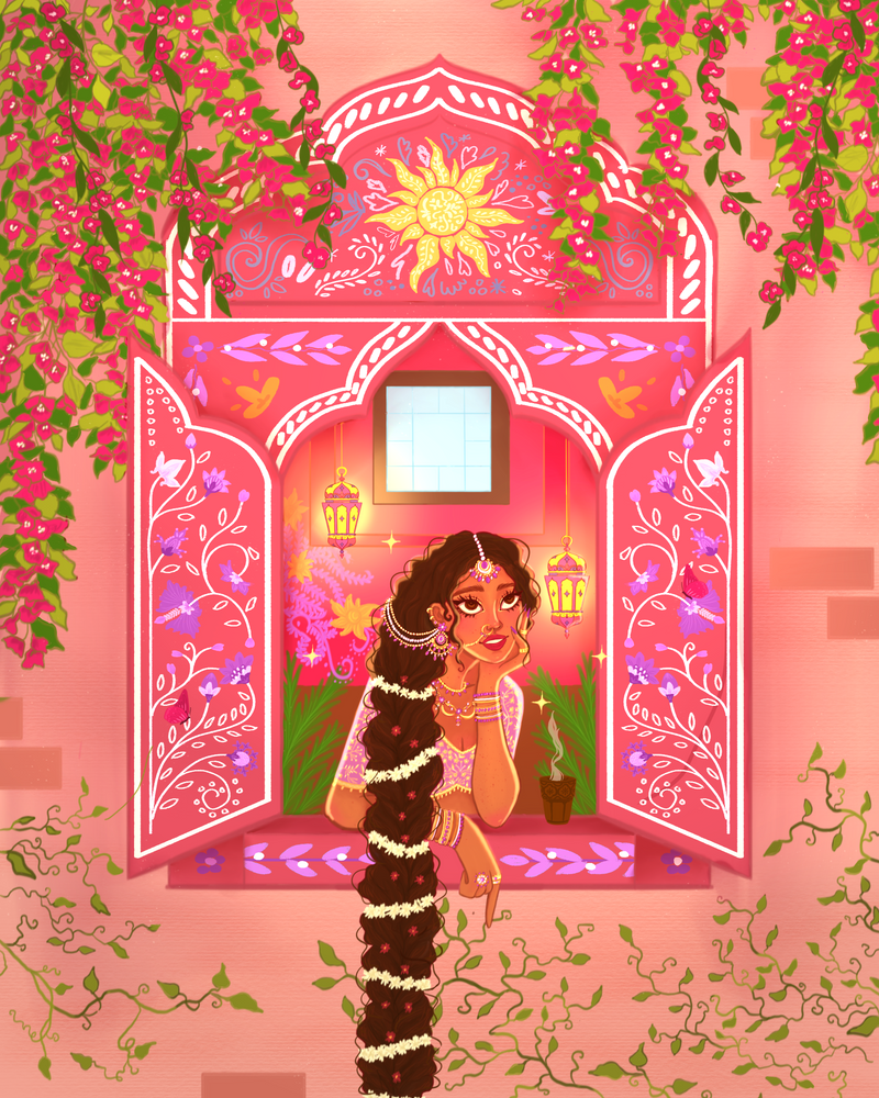
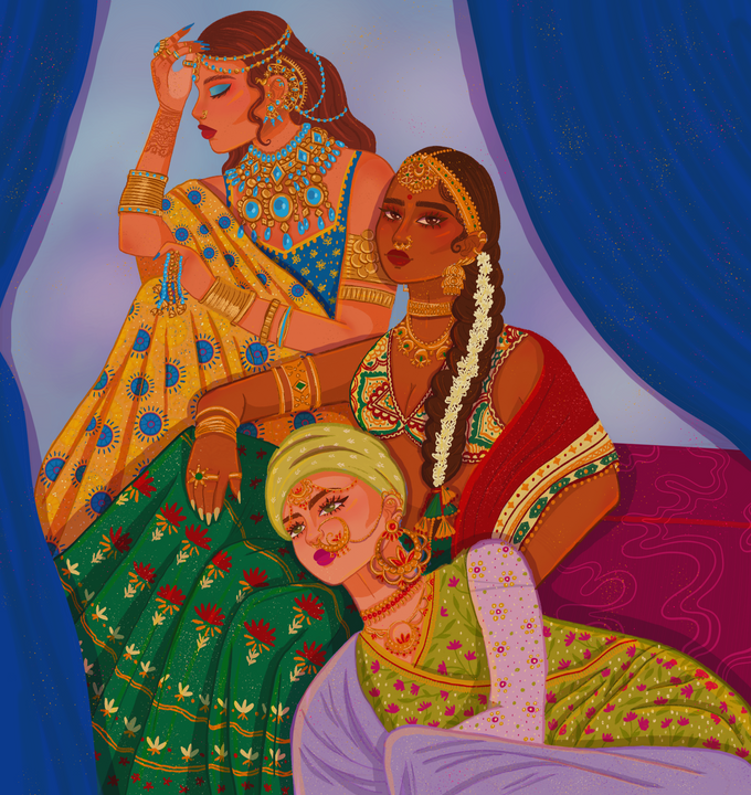
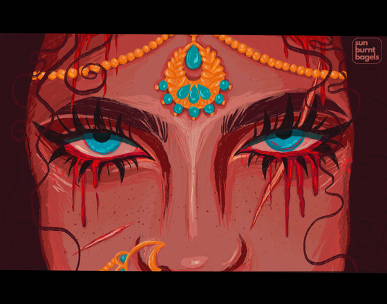
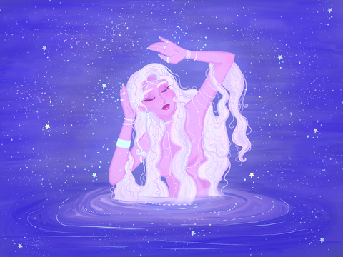
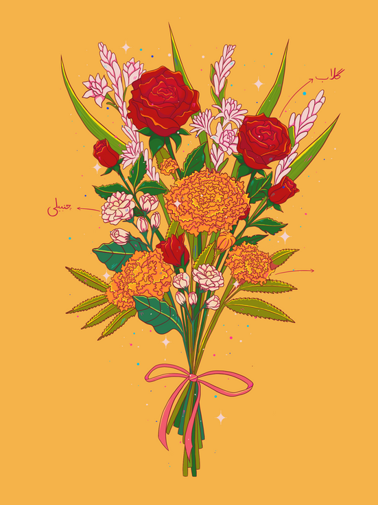
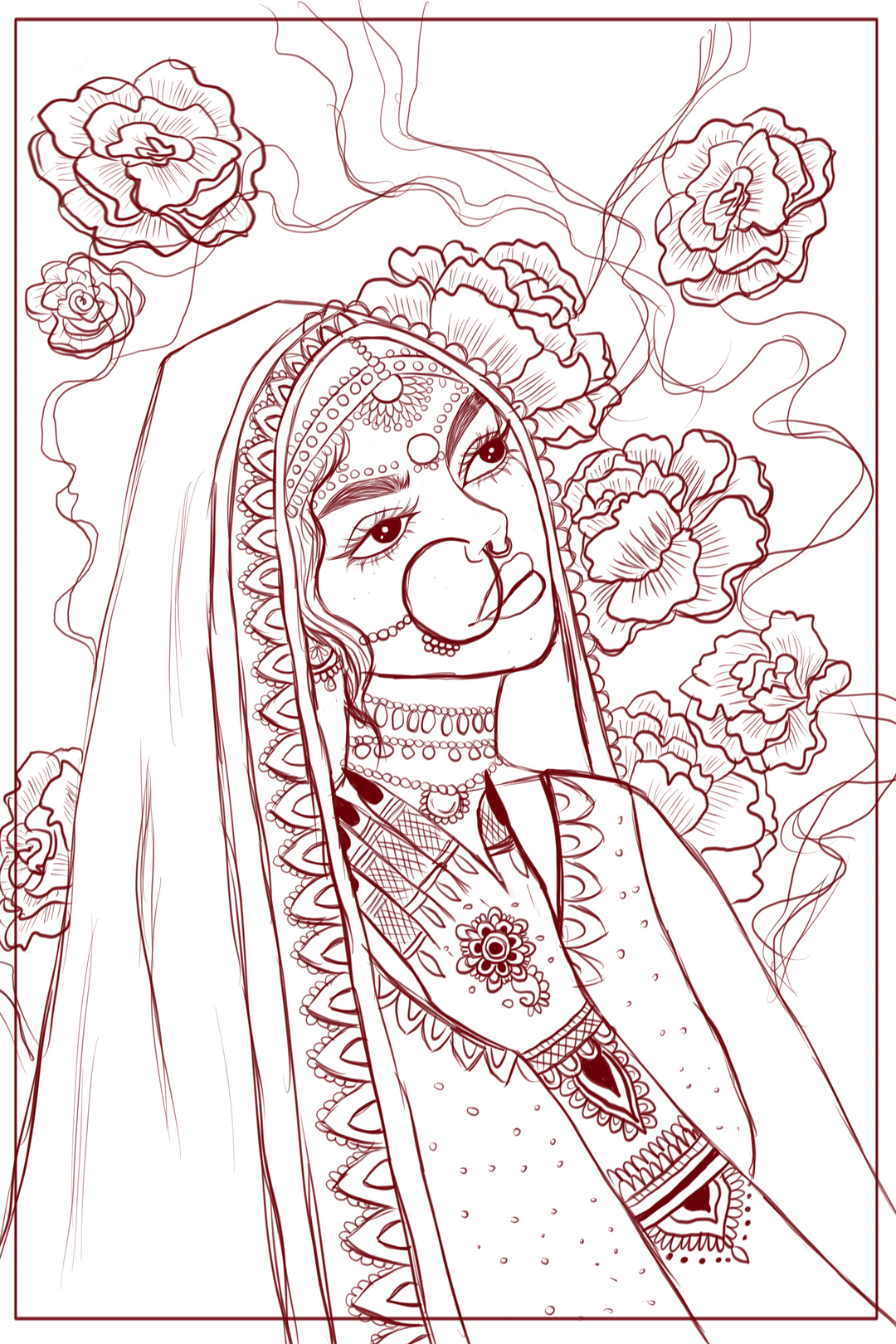
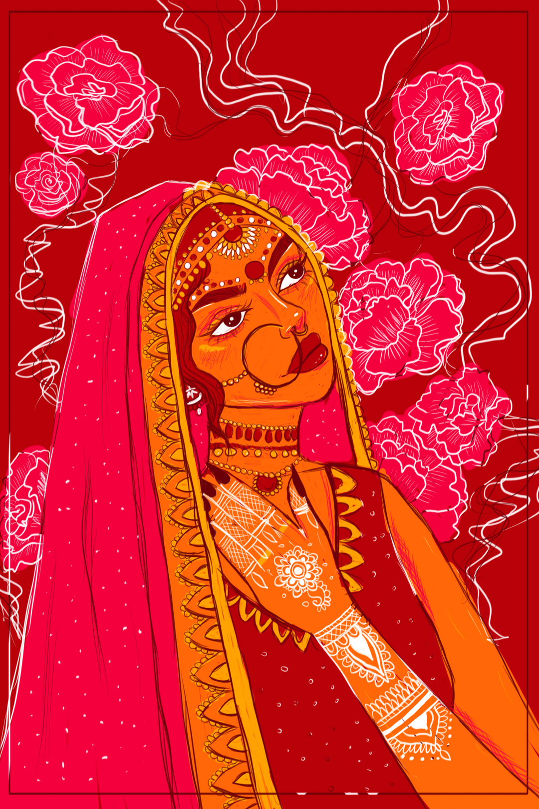
Here is a showcase of my favorite digital illustrations I've done, including both commissions and personal work
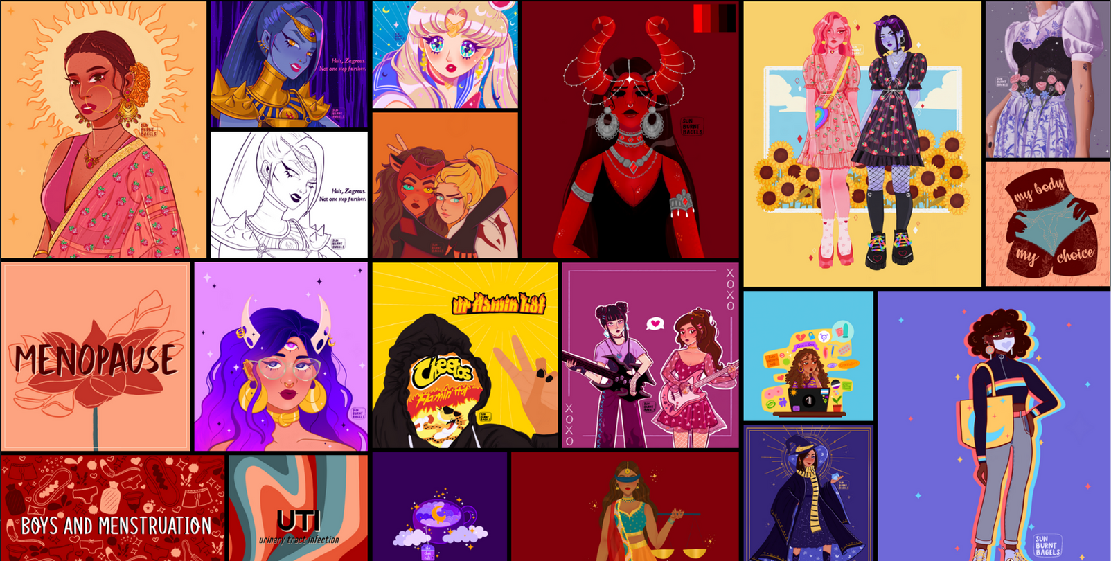

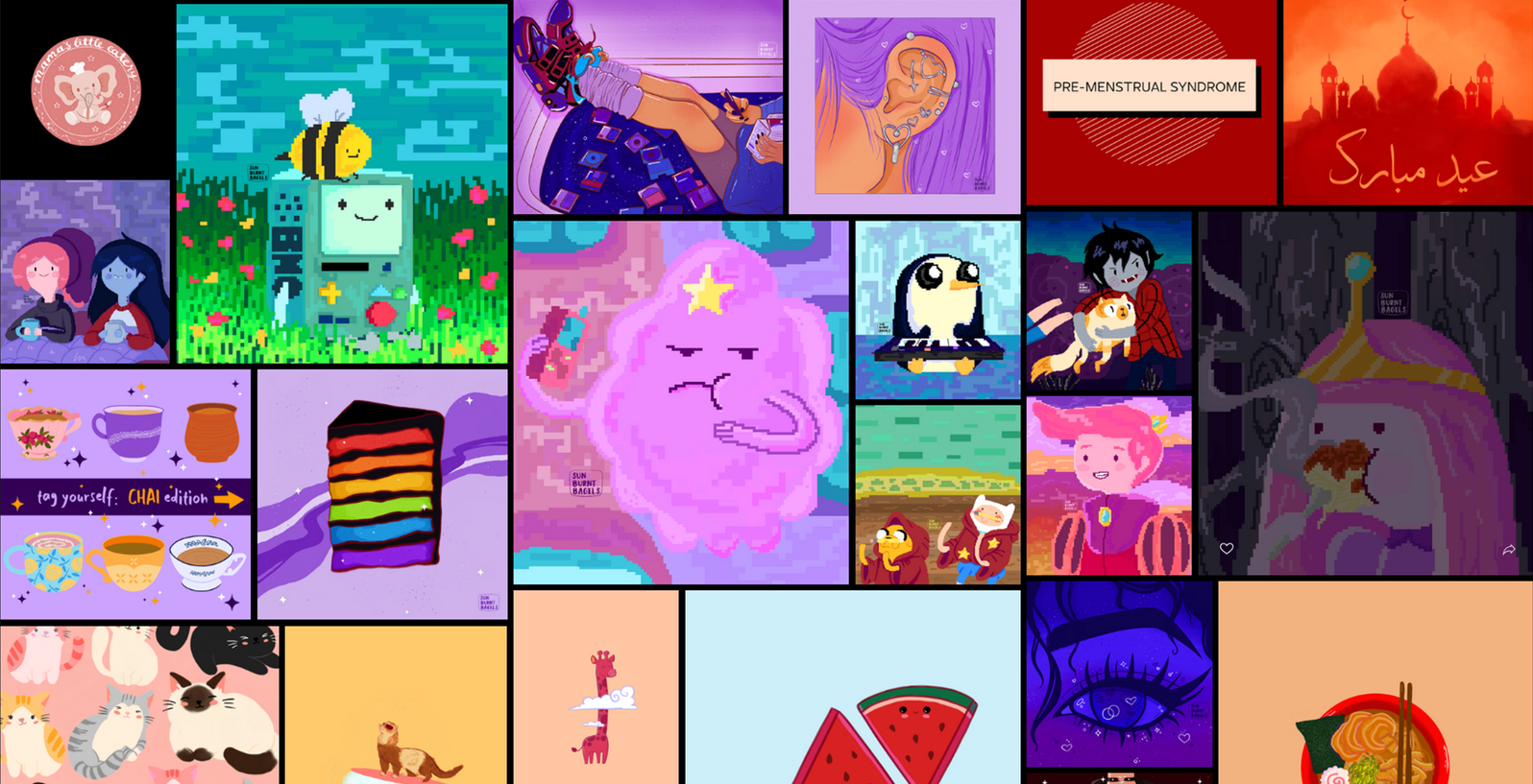
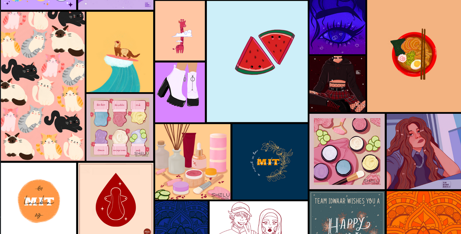


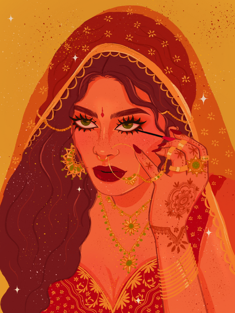

More digital client work, illustrated in Sketchbook & Procreate.
Projects & Details
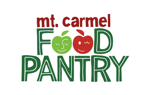
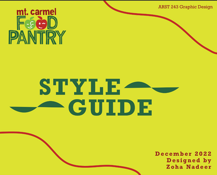
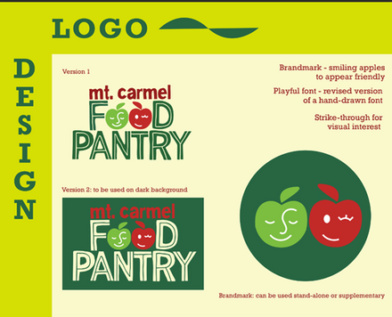
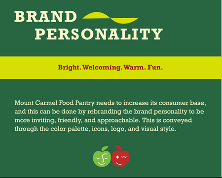
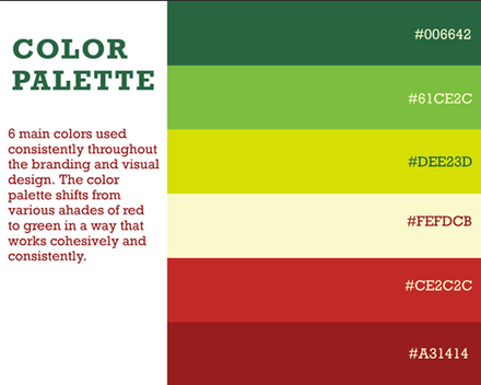
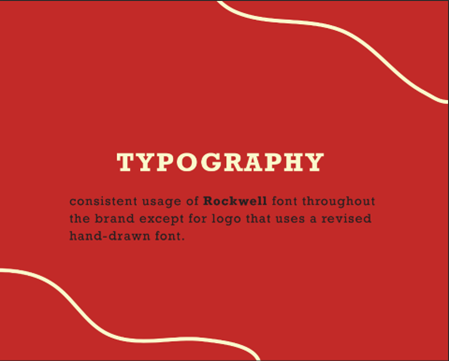
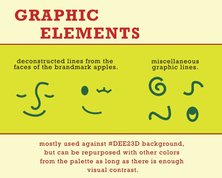
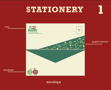
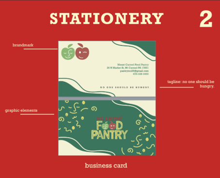
MOUNT CARMEL FOOD PANTRY REDESIGN
I redesigned Mount Carmel Food Pantry's entire brand identity, including logo, branding style guide, stationery templates, business cards, etc. This redesign won a popularity award from the Bucknell University design department.

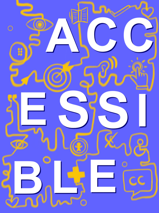
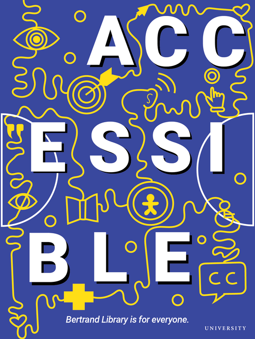
Bertrand library poster design
This library poster design was based on the word 'Accessible', to represent different aspects of the Bertrand Library. I used contrasting colors to make sure the poster was readable and illustrated icons to represent the library's accessibility features.
concept sketch
final design
Bucknell graphic Design
I was hired by Bucknell University to design an illustration for the Department of University Advancement to be sent out to all Bucknell alumni in the calendar year-end mailing. I contributed to elevating the university’s image through creative and purposeful design efforts.
concept sketches

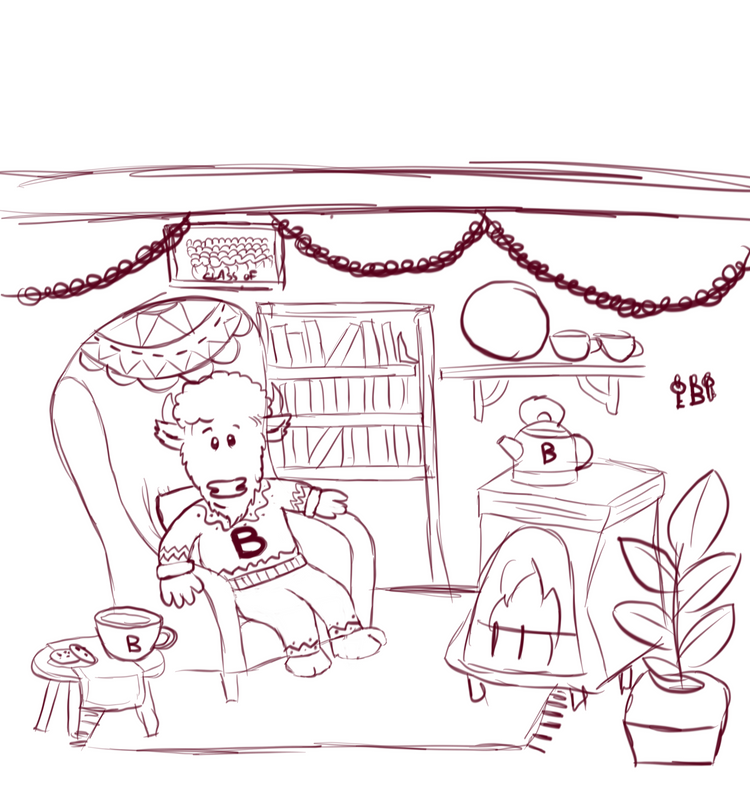
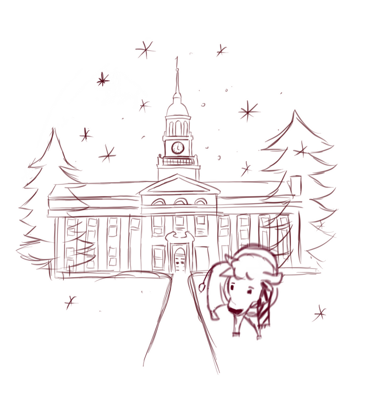
final design

Photography Projects
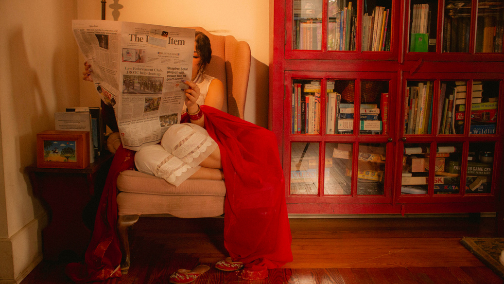
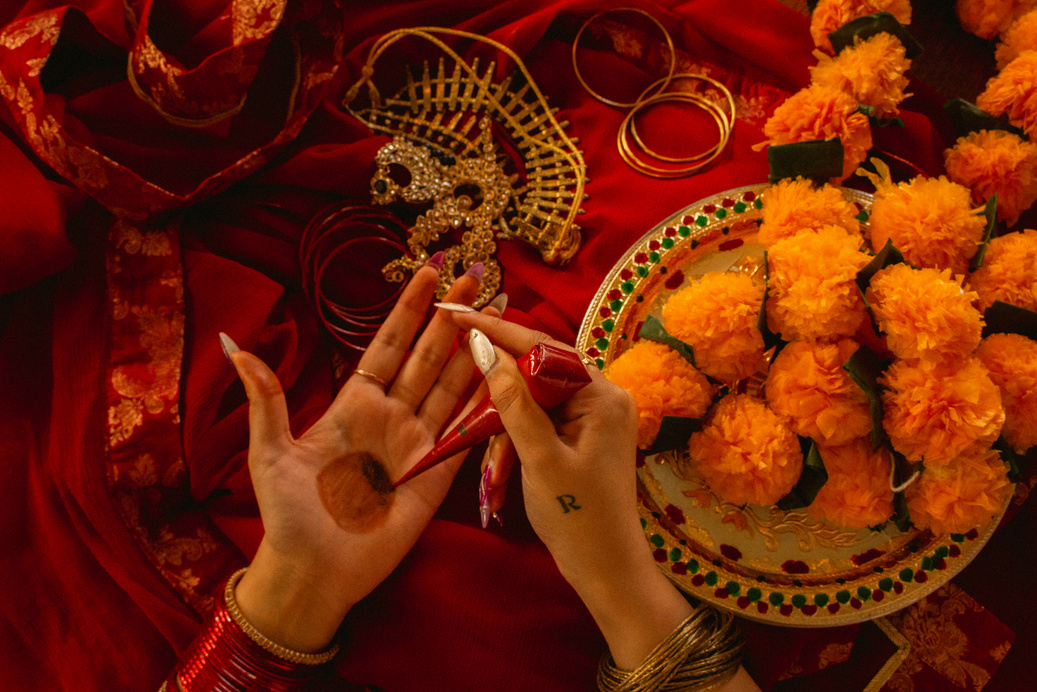
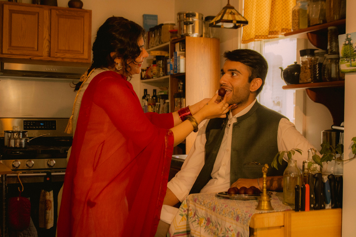
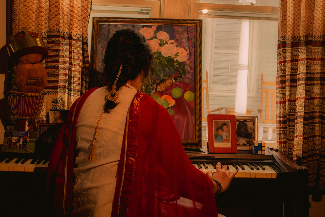
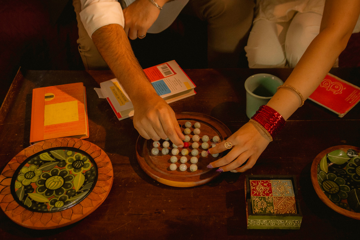
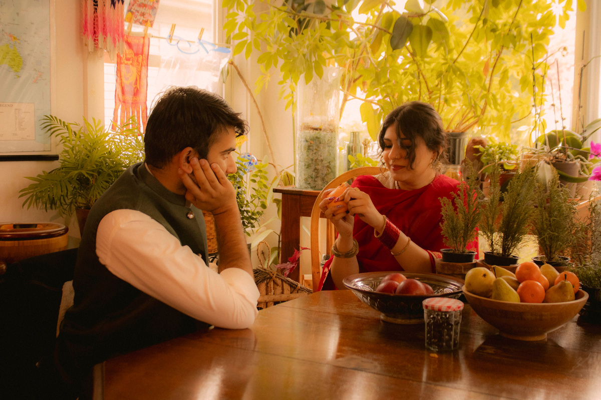
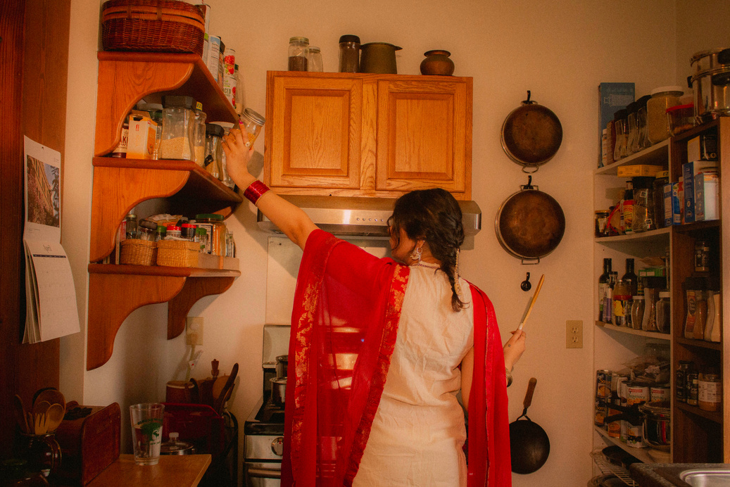
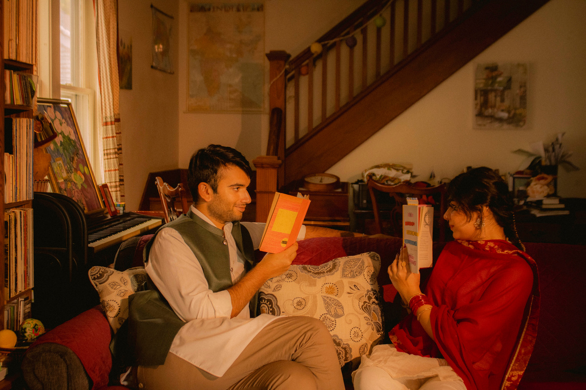
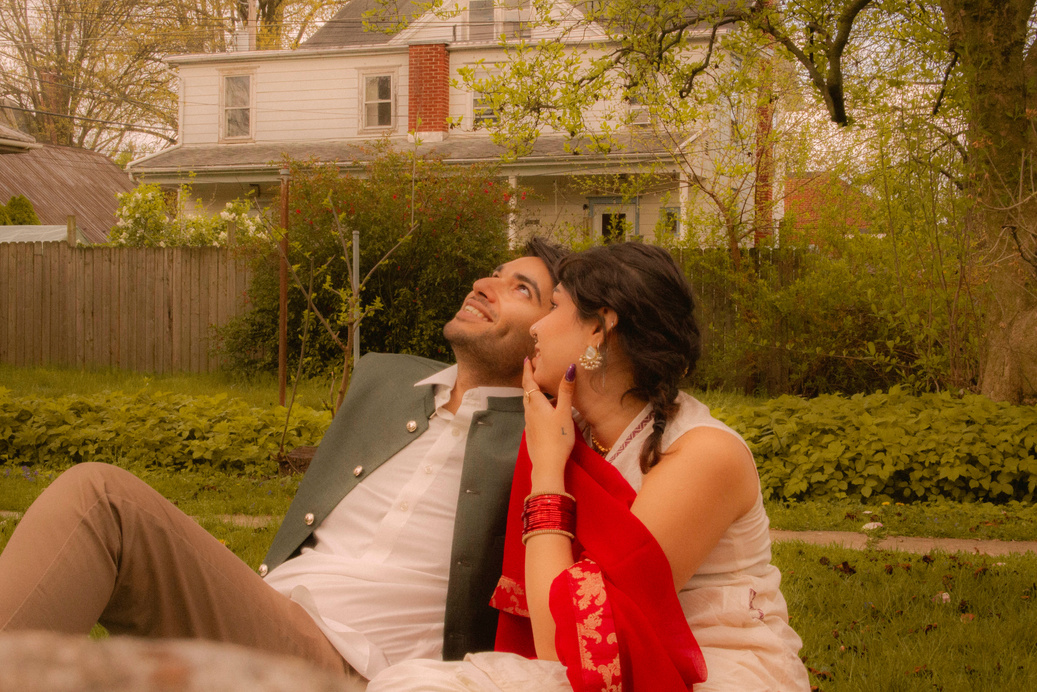
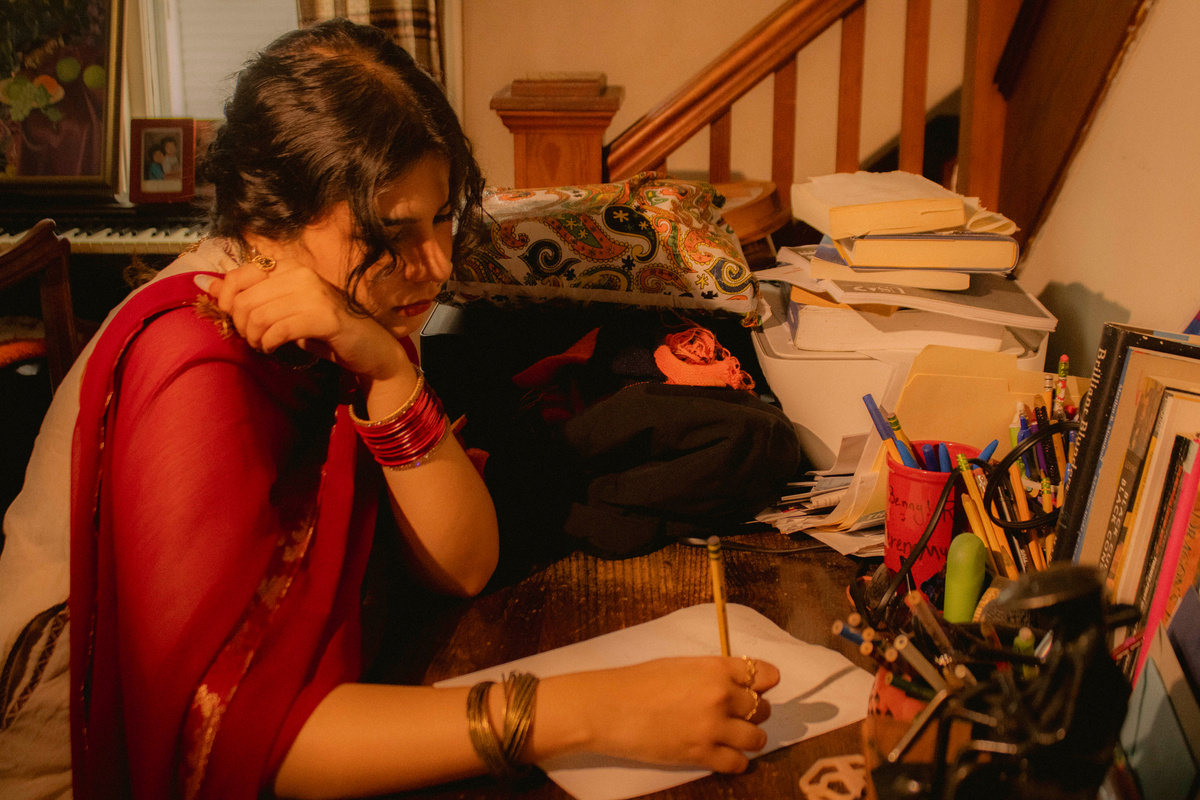
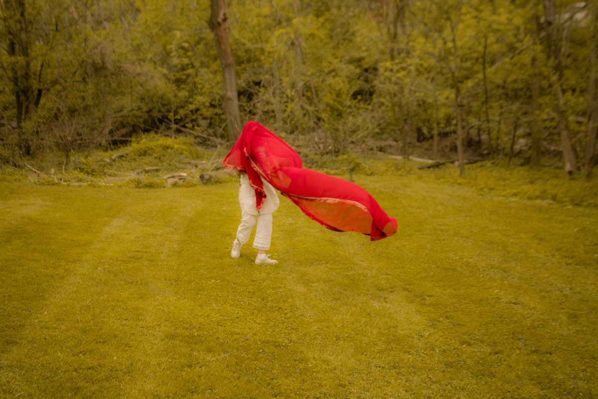
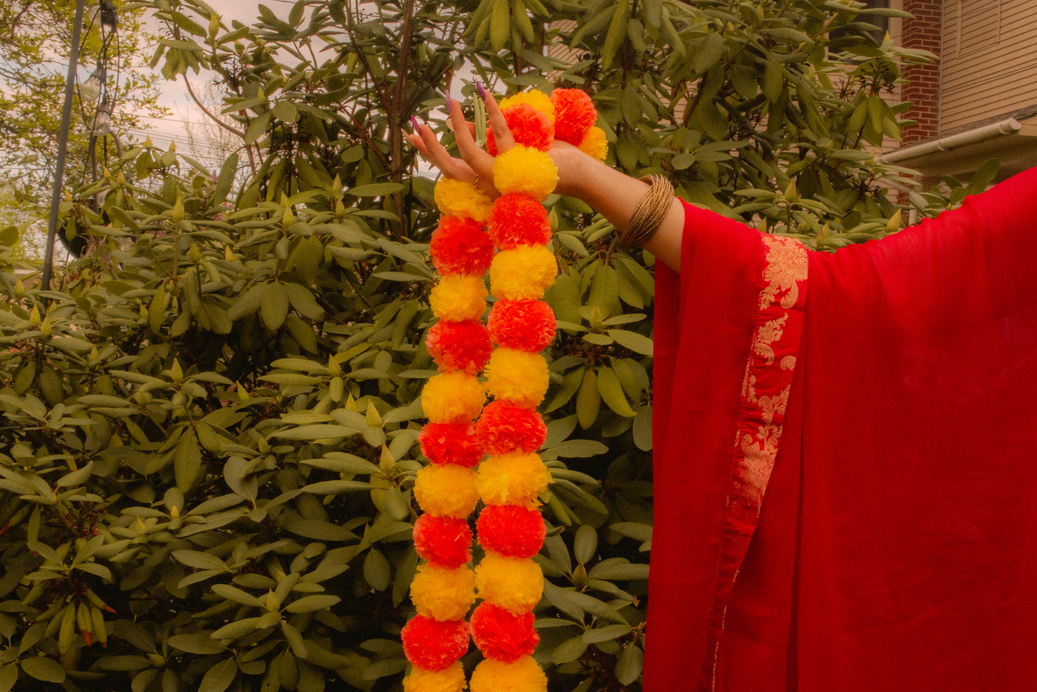
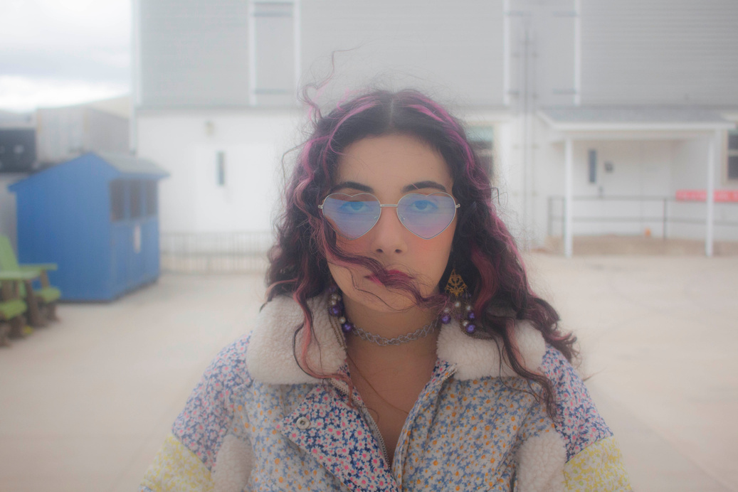
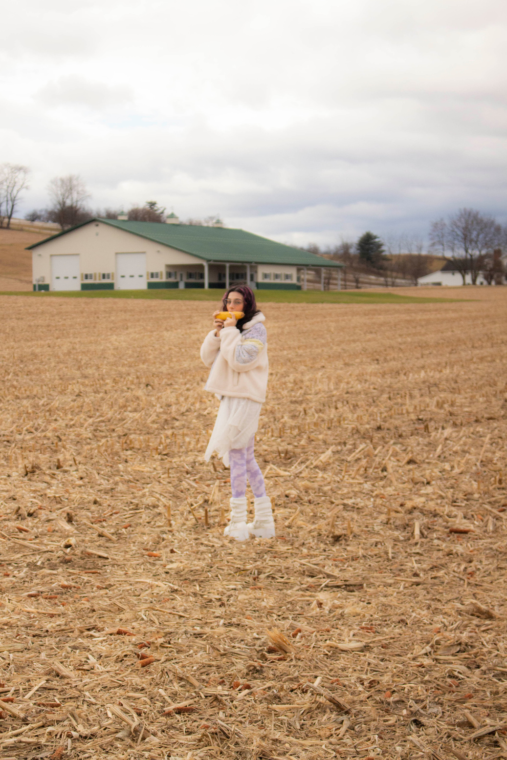
1. This portfolio was inspired by my love for vintage Bollywood movies and the soft, nostalgic romance that takes place in that era. I used a lot of soft colors, moody lighting, and natural staged sets that make it feel like you are watching a romantic love story play out.


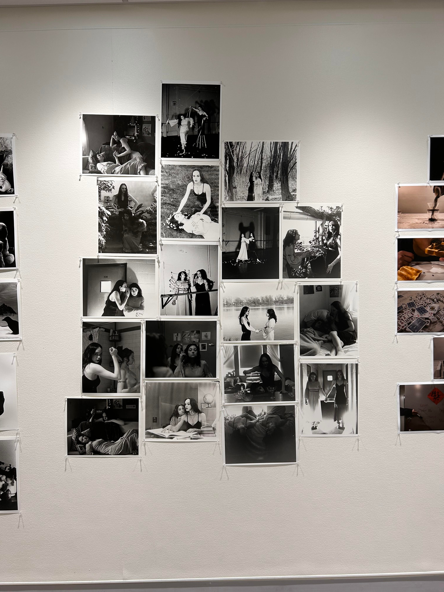
2. This portfolio is in a Tableau Vivant photography style and is inspired by Bad Dreams. I staged each set and used a film camera to take these photos, and then developed my own black and white film using Darkroom techniques to enhance the quality of the printing.
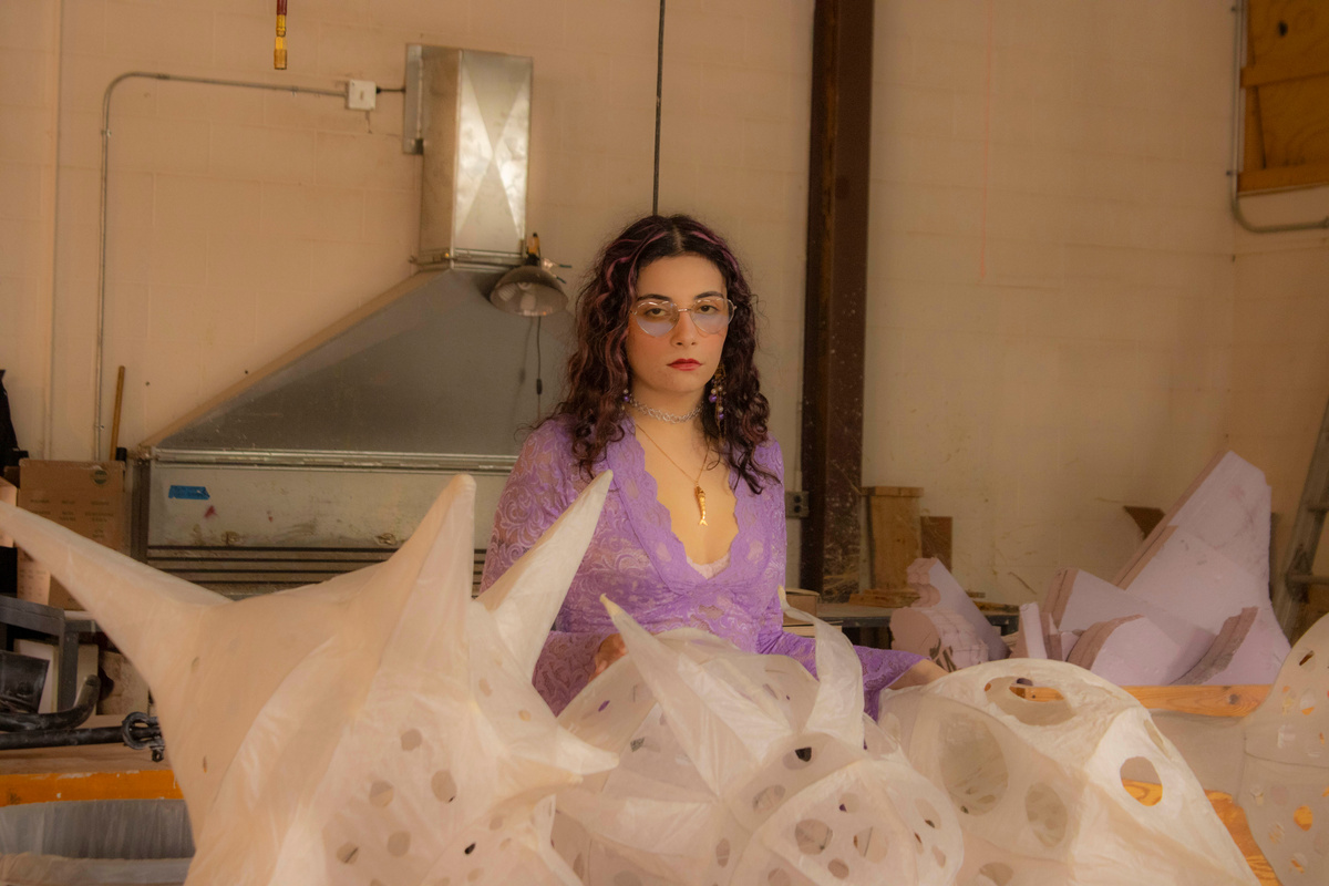
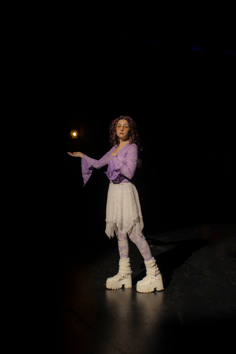
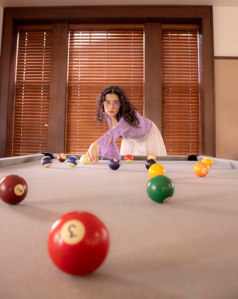
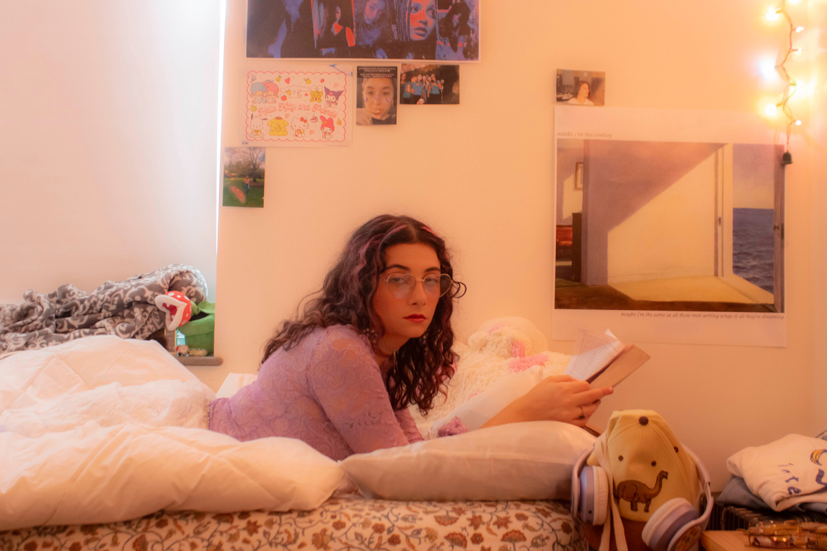
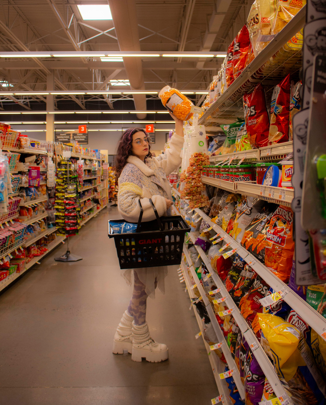
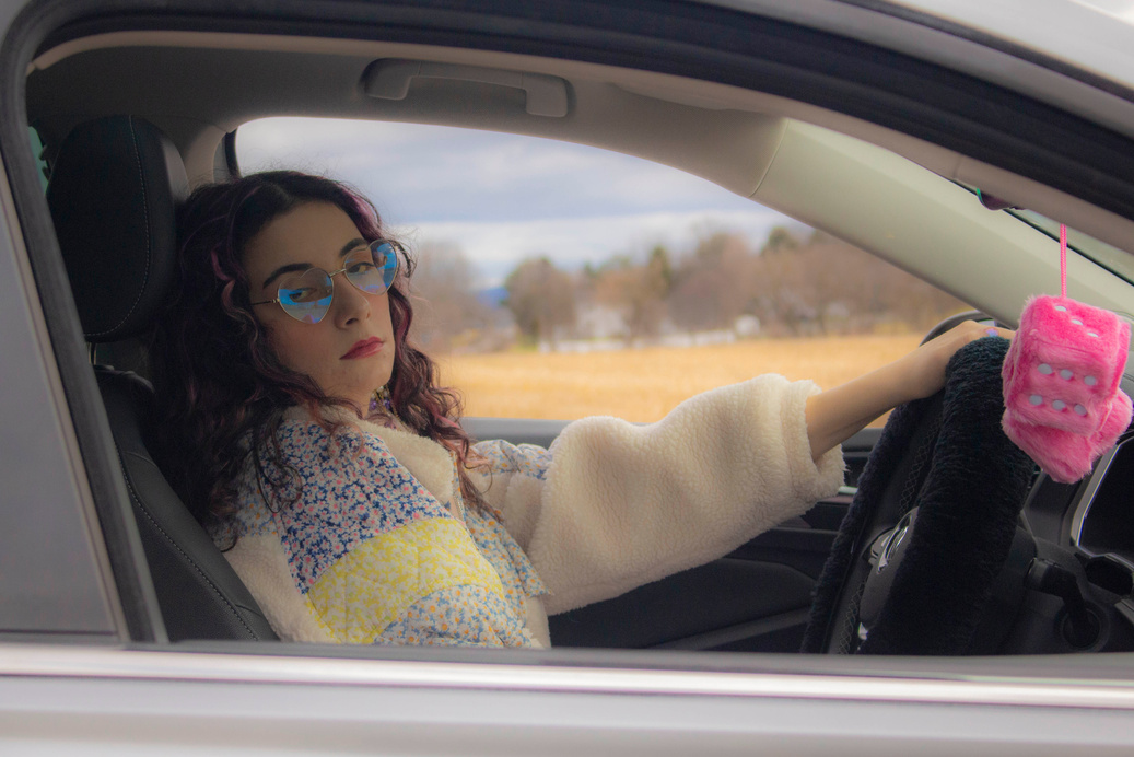
3. This portfolio is a performance for the camera in which each image serves as a poignant reminder of the paradoxical relationship between subject and observer, inviting viewers to contemplate the underlying emotions behind the facade. Through this project, I explore the realm of performative disinterest, where every glance speaks volumes about the complexities of human interaction with the camera.


PRINT WORK
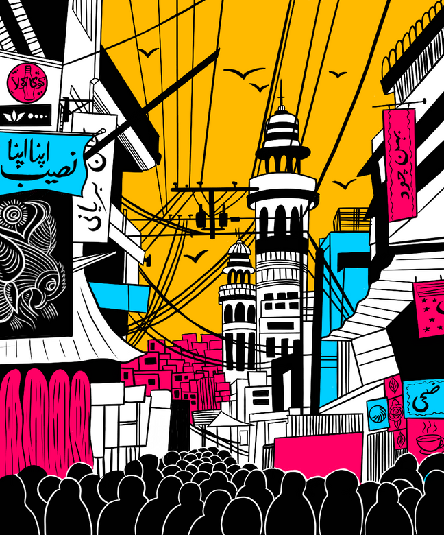
Print work for a project representing one of the cities I grew up in. First digitally illustrated in Procreate, then printed in 21 editions using various linocut and screen-printing techniques.

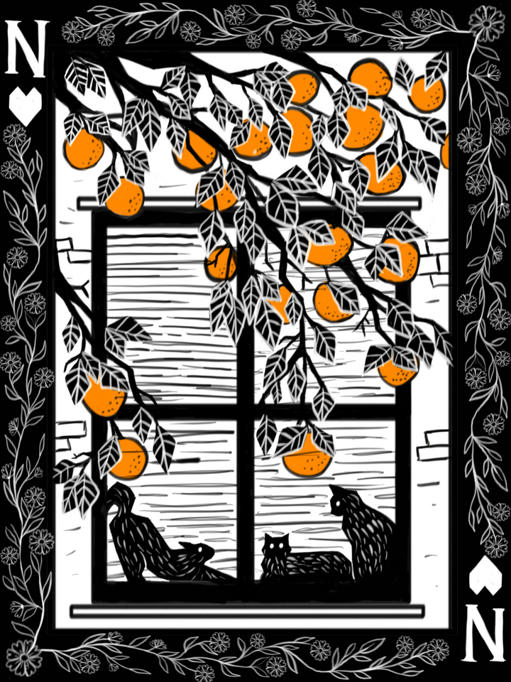
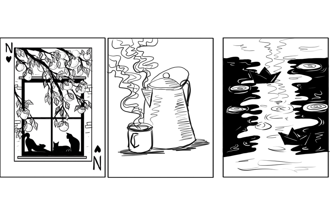
Print work for a linocut project showcasing the different stages of linocut work / layering procedures. Digitally illustrated with concept sketches --> linocut and inked in editions of 3
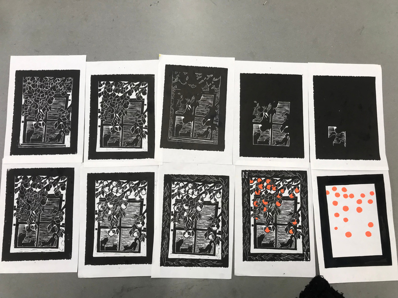
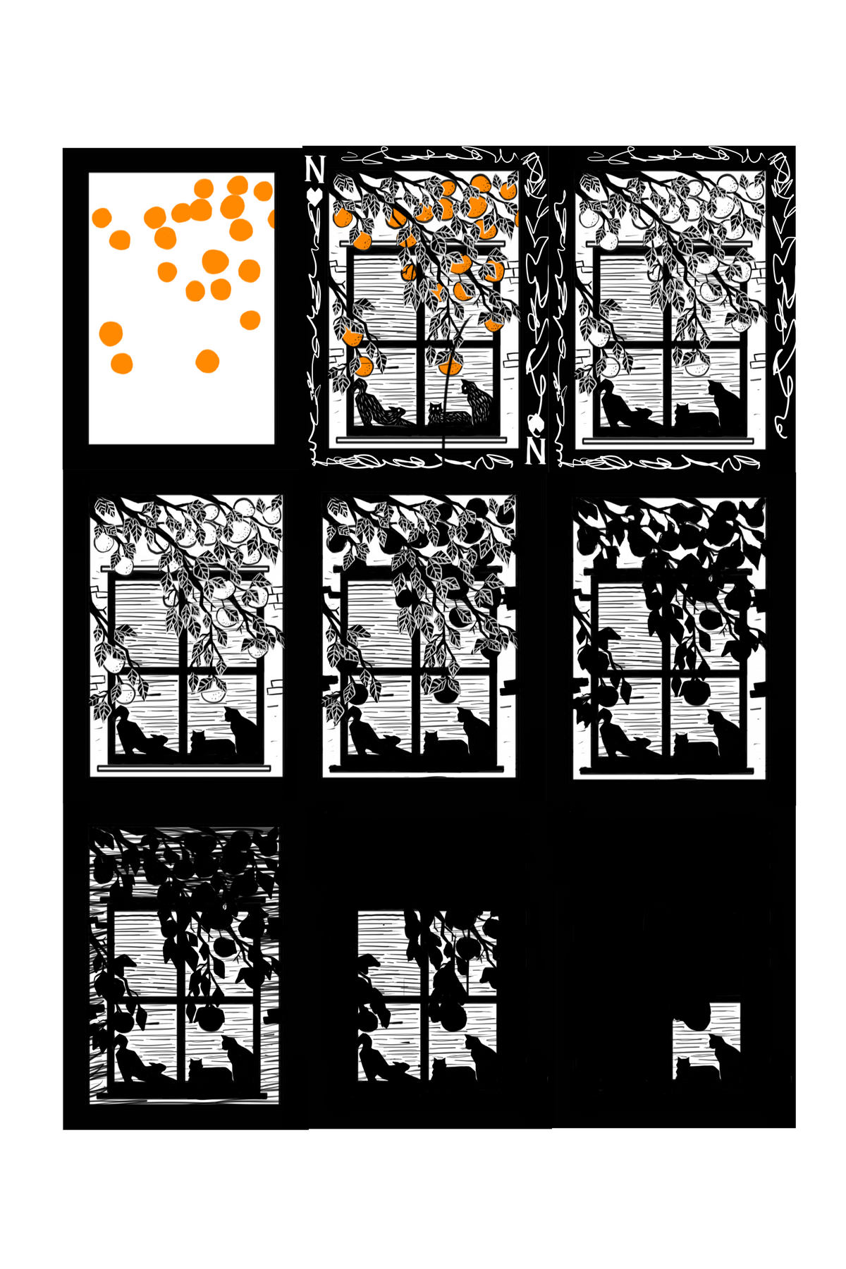
Layered linocut work with different colors. Digitally illustrated and then inked in editions of 8. Representation of a memory/feeling. For me it is growing up back home in Pakistan and embracing South Asian culture and heritage.
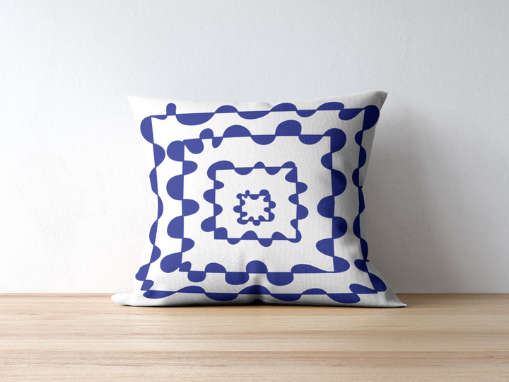
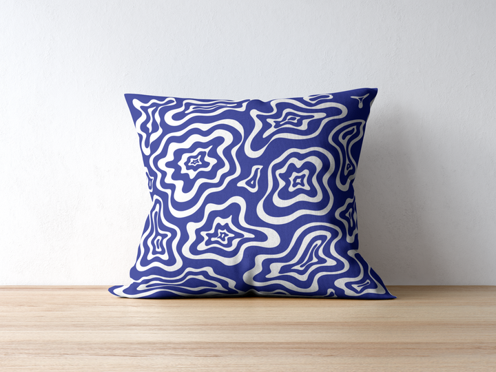
Commissioned to design a pillow cover set of 3 by a client who wanted abstraction, blue and white color palette and whimsical designs.

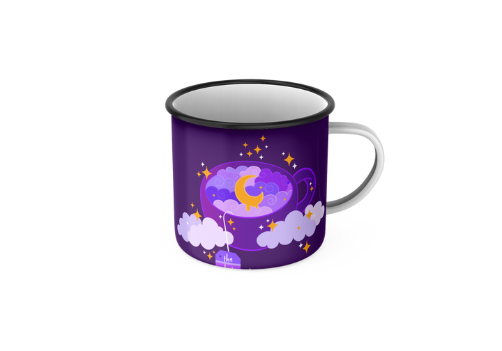
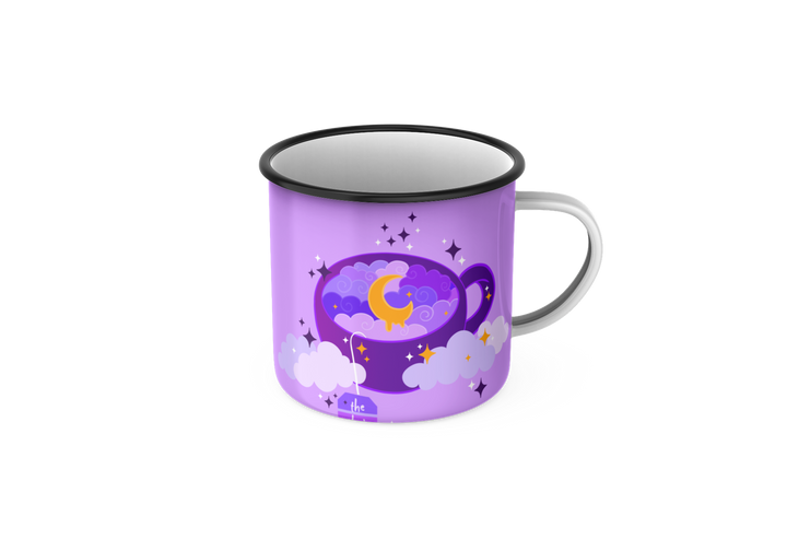
Commissioned to design a custom mug for a client who wanted a witchy, whimsical design that matched the aesthetic for their company.
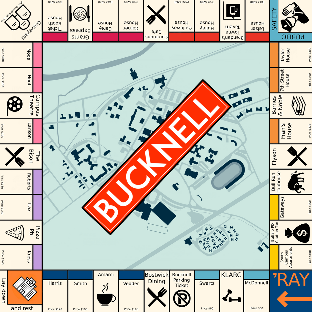
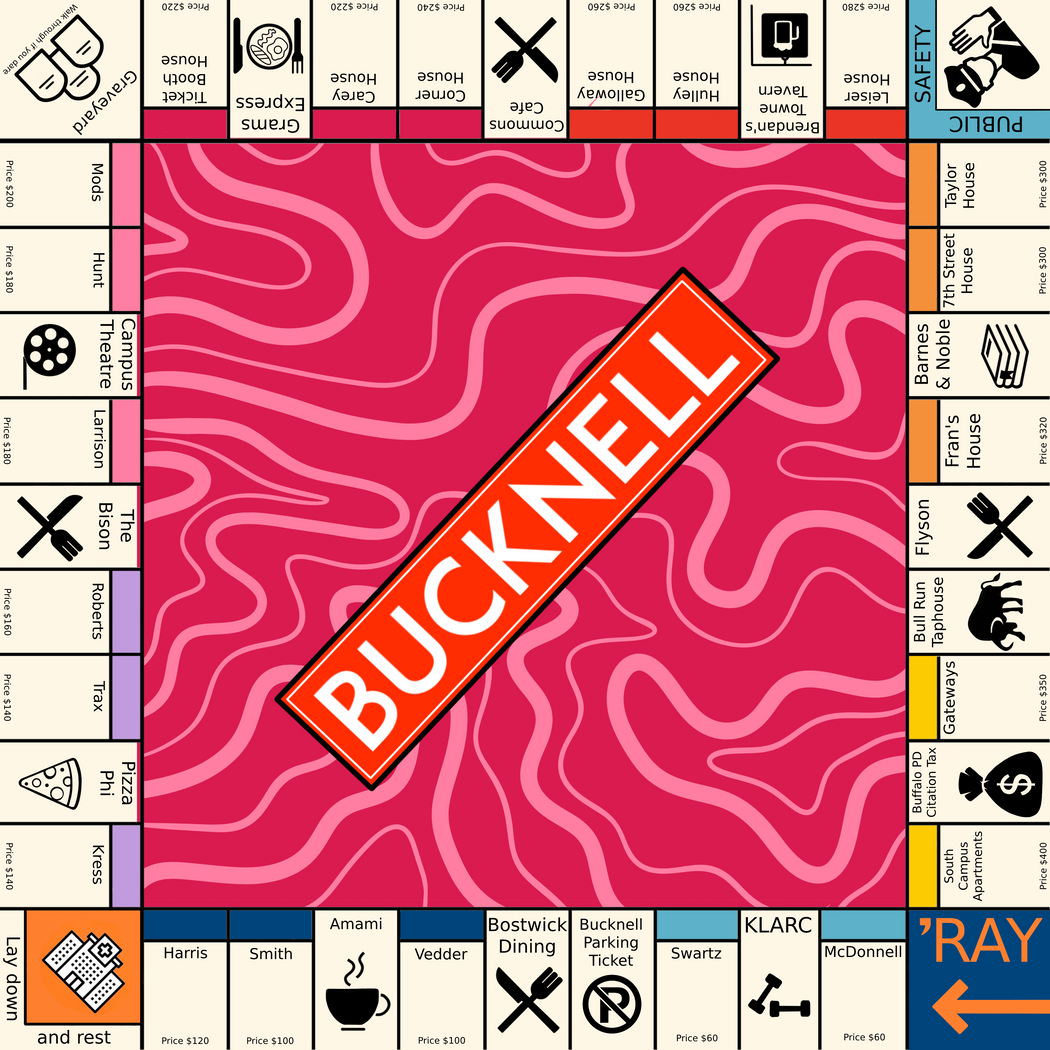
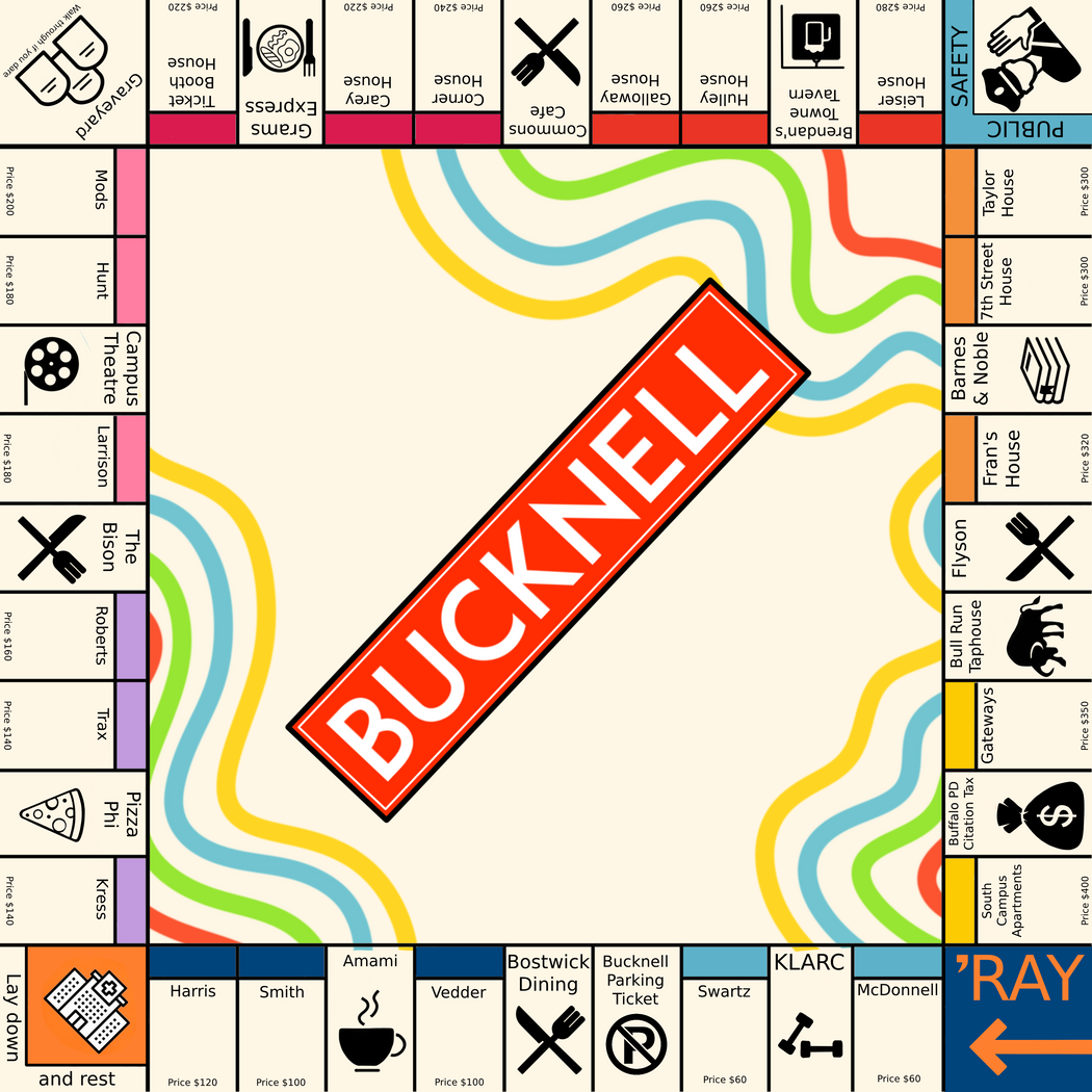
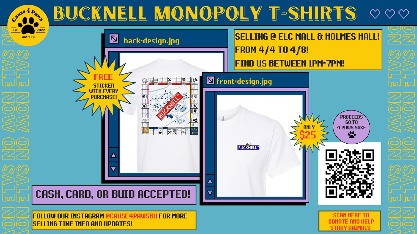
Bucknell mONOPOLY THEMED T-SHIRTS
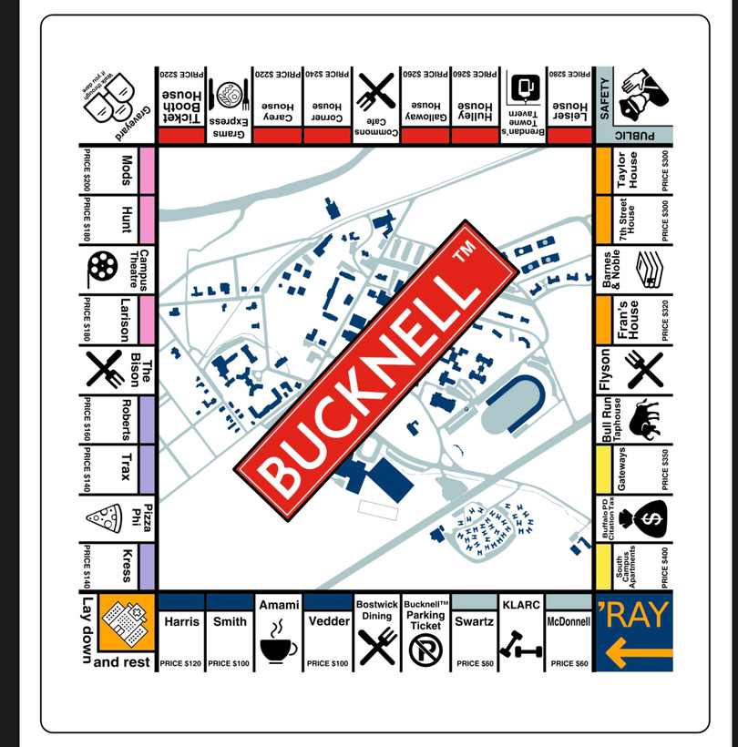
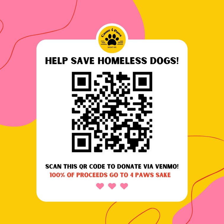
My MGMT 101 company (Cause 4 Paws) partnered with a local Lewisburg animal shelter, 4 Paws Sake, to raise funds for them. The product that we decided to sell was a t-shirt, and I created this Bucknell themed monopoly design based on an existing framework. The locations on this Monopoly board include the various locations on Bucknell's campus and downtown Lewisburg, and the background of the board is an illustrated version of the map. The design invokes a feeling of nostalgia and a sense of belonging to the university. We sold 350+ t-shirts to students, faculty, staff, and alumni.
Here are some of the versions I created before the final approval
I was also the Advertising and Promotions Manager for Cause 4 Paws, and was responsible for coordinating social media and print advertisements, PR, and e-mail campaigns for product launch and fundraising events. I designed these posters and social media posts for promotional purposes.
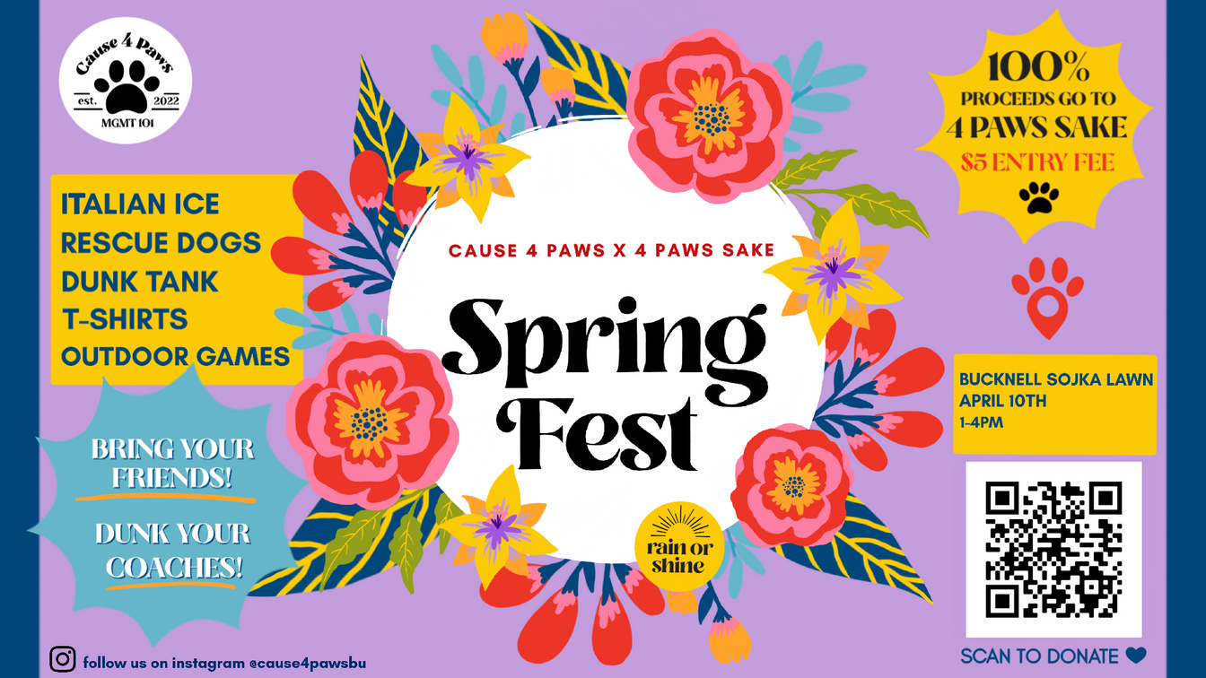
I created a color story for our branding to ensure consistency and recognition and designed an appropriate logo for our company


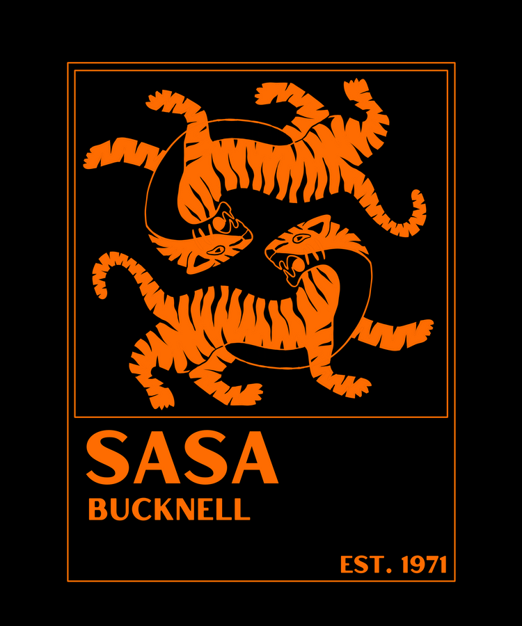
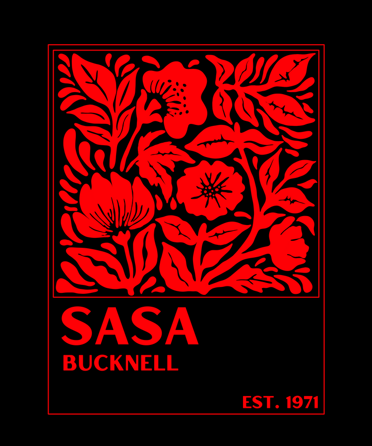
south asian student association vinyl hoodies
My experience in digital fabrication techniques as a Maker Assistant at 7th Street Studio & Makerspace, Bucknell University allowed me to design apparel for SASA. I created the design in Procreate and Illustrator, used Cut Studio to cut the vinyl, and then heat-pressed it onto the hoodies.
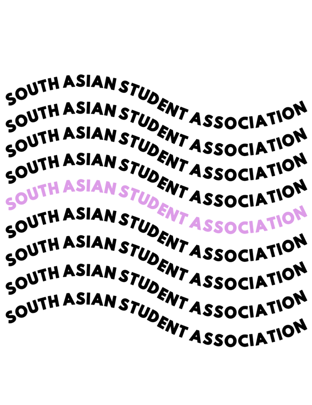

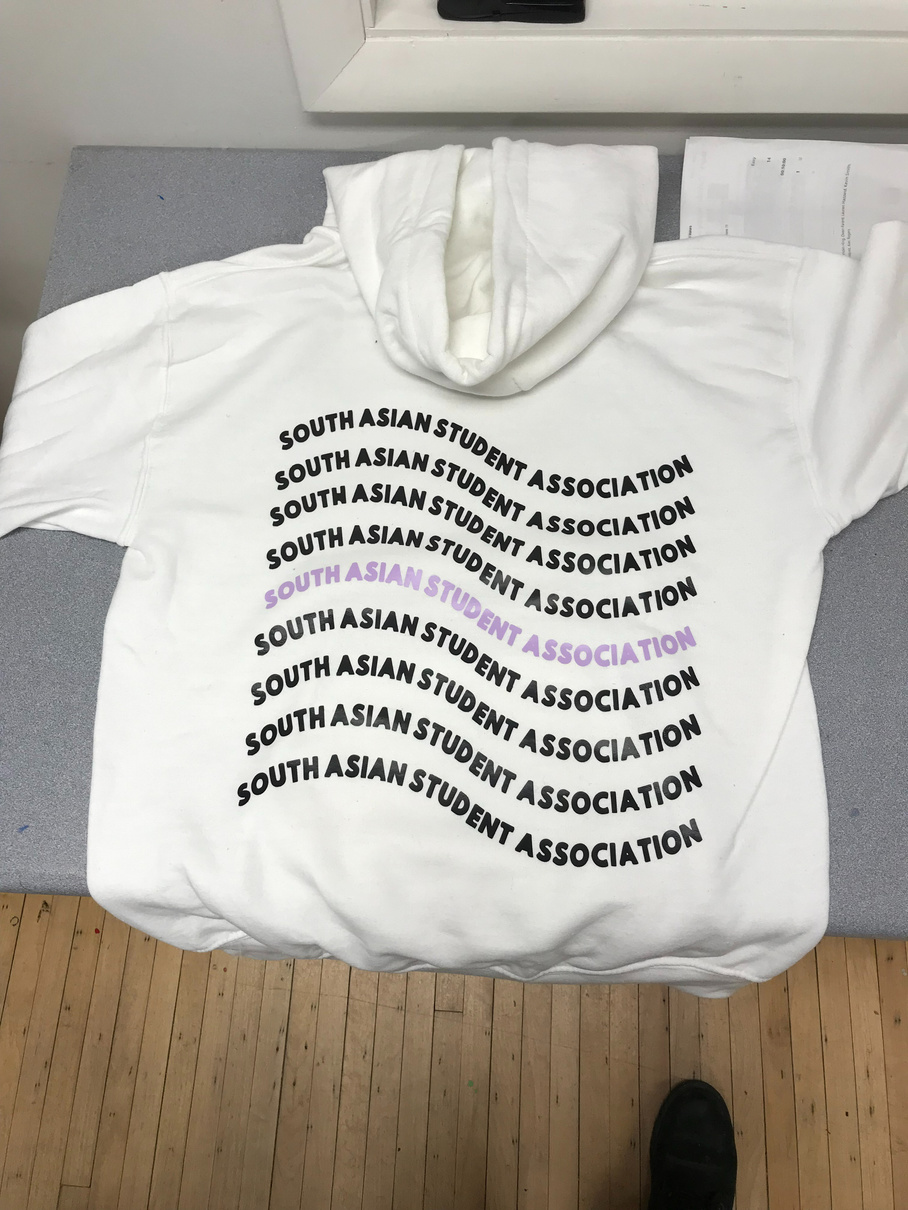
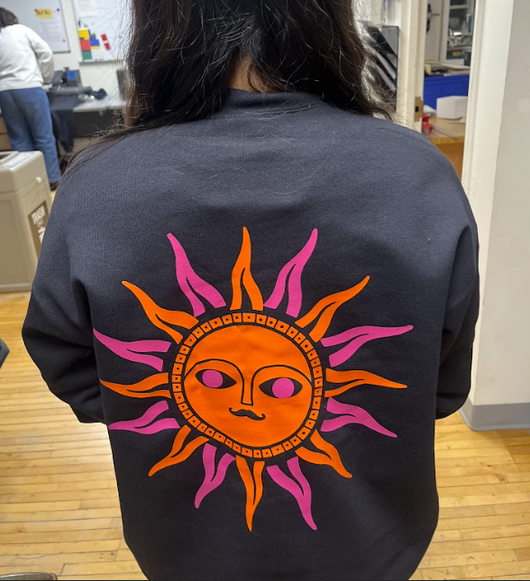
The second year in a row I designed these hoodies for the South Asian Student Association. I was inspired by vintage matchbox designs and wanted to create something that would feel nostalgic and inviting.
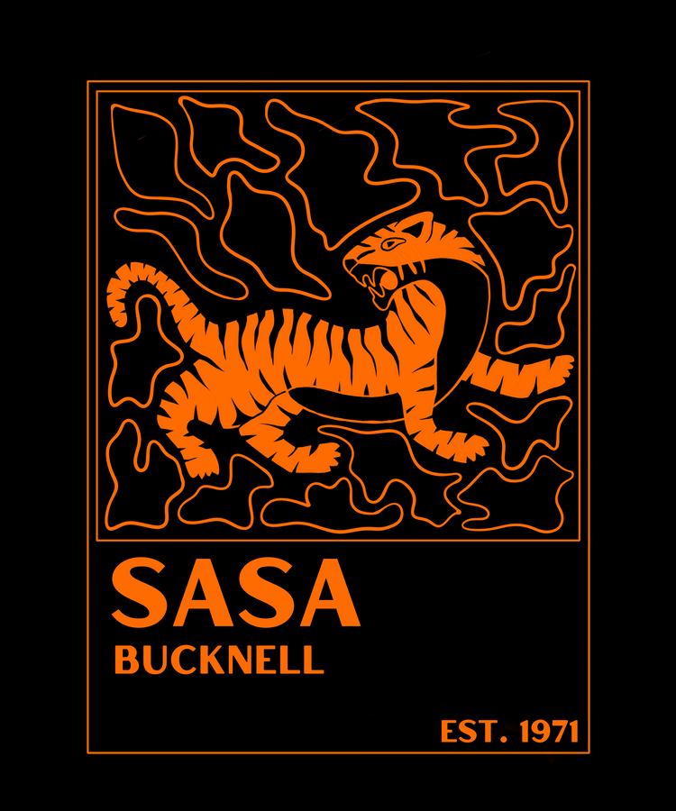
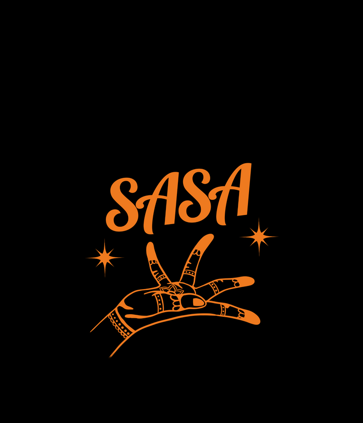
The third year I ended up creating a new logo and brandmark for SASA and used that design for the vinyl sweatshirts we made for that year.

New logo!
Hoodie front design
Hoodie back design
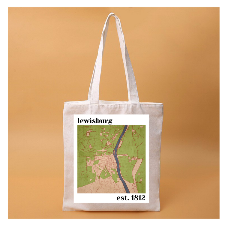
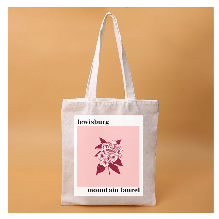
I designed these tote bags to represent my college town: Lewisburg, PA. Mountain laurel is the state flower of Pennsylvania and the map is an illustrated map of local Lewisburg
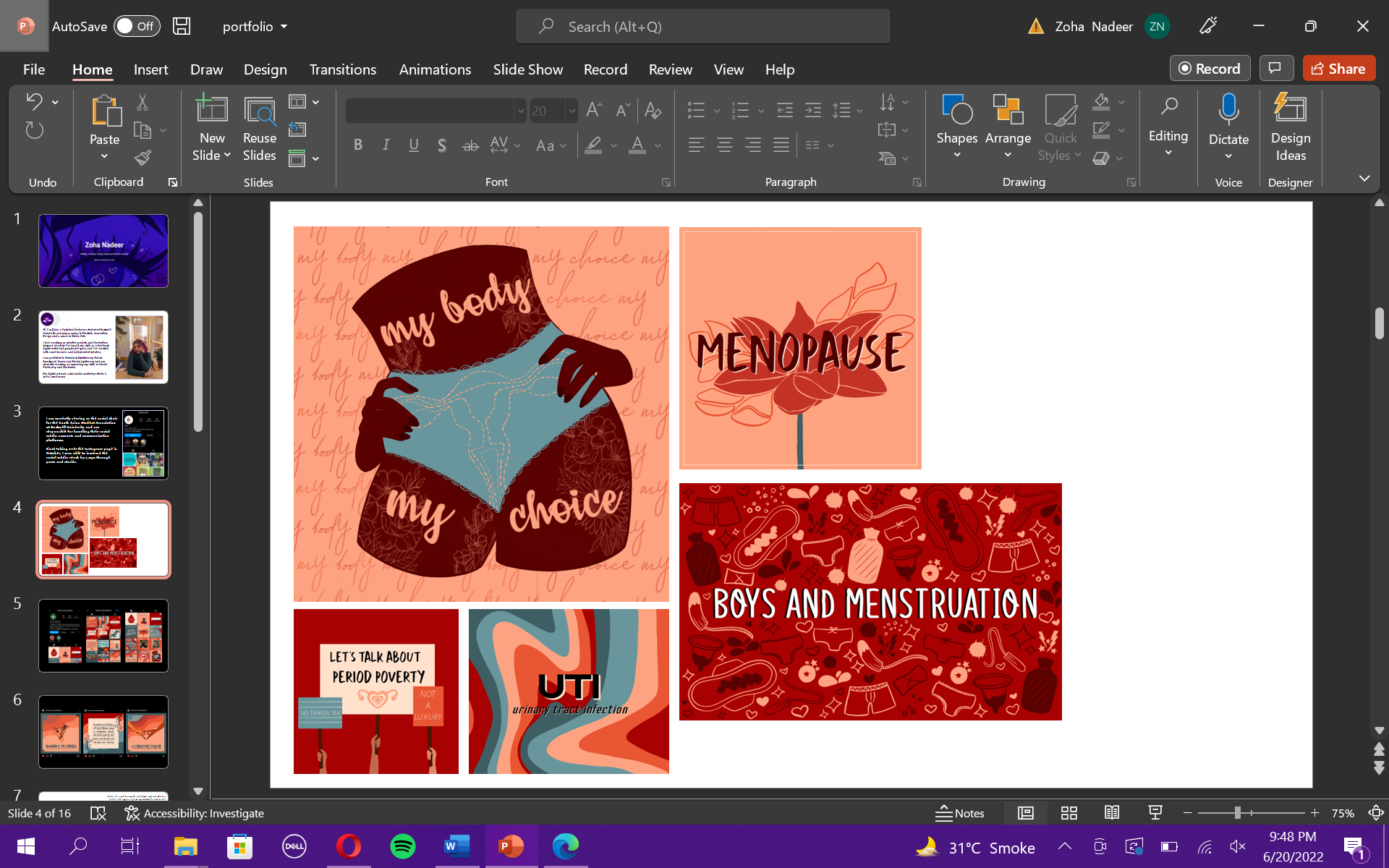
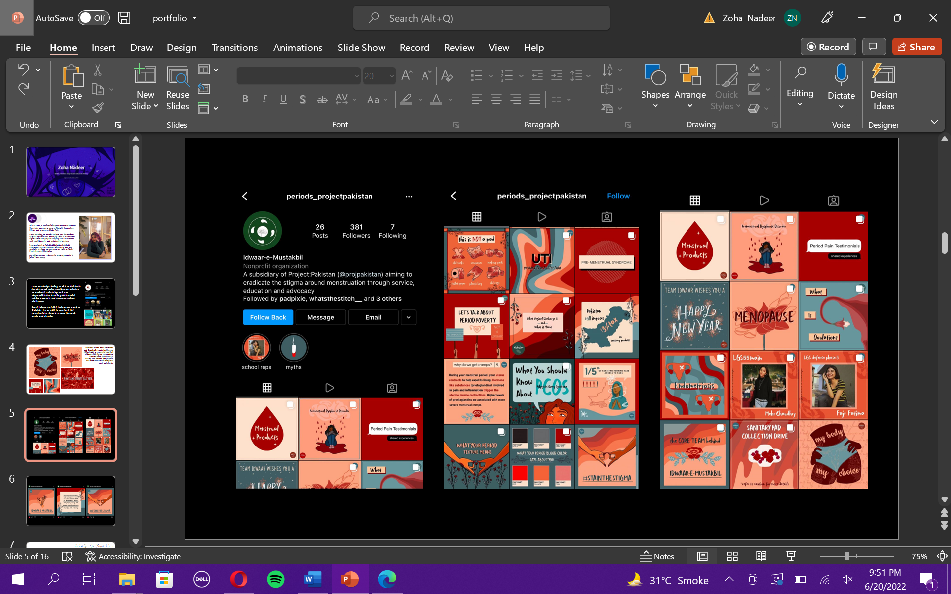
I worked as the Head Illustrator and Graphic Designer for Idwaar-e-Mustakbil, a non-profit aimed at reducing the stigma surrounding menstruation and women’s health, and created infographics and content for their Instagram posts and stories

Illustrations for DESI e-magazine, 2020
Feel free to get in touch with me!
email: zoha.nadeer@gmail.com / zn007@bucknell.edu
linkedin: linkedin.com/in/zohanadeer
instagram: @sunburntbagels